
Don't Need Much Money is exactly what it sounds like: a site about needing less, so you have more. More time. More freedom. More room to actually live. The idea is simple. The less money you need to survive, the more time you have to thrive. Lower your living costs, live a healthy lifestyle focused on longevity and mobility, stay out of debt, and build a little savings, and you buy yourself something far more valuable than money: time. Time to do what you actually love, spend with people you care about, and put toward things that matter. This site is my own real life running that experiment. Most of what you'll find here are recipes and day-to-day habits. They aren't filler posts, it's intentional. Cooking from scratch, buying smart, wasting less, eating well, and staying healhty, fit, and limber all without spending much are some of the most direct ways I practice this philosophy day to day. This blog doubles as my own recipe box and exercise notes, and I share it b...
Every now and then, I dabble in digital design. Most of the time, it's to make presentations and reports more graphically interesting by choosing colors that match a company's logo or brand identity. Microsoft PowerPoint is my go-to application to match colors, and I'll walk through an example using Google's logo to find each specific digital color they use.
The first step is to grab Google's logo by either searching for an image or taking a snapshot of google.com. Then paste it into a PowerPoint presentation file using the Title Only layout.

Next go into the title box and click on the font color icon. You will see an eyedropper. Select that and put the eyedropper cursor over one of the logo colors. I chose the blue color first.
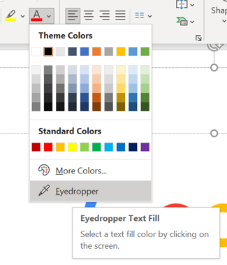
That blue color has now been added to the color palette. I can learn more about it by clicking on "More Colors".
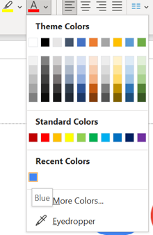
Now I can see the exact makeup of red, green, and blue values (RGB) that create that color. In this case it is 66 Red, 133 Green, and 244 Blue. And now I have the exact digital color that Google uses for their blue.

I can repeat the steps for the remaining 3 colors in Google's logo. I can also hover the eyedropper over the color, and it will display the RGB values before clicking on the color itself.
Here are the values:


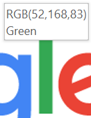
Now with these values, I can use these in any program that allows customized colors. In Excel, I can create tables that use these colors for shading. In Word, I can color fonts for header sections. Even in Outlook, I can create a custom signature that uses these colors.
The next time you want to match specific colors for your own needs, be sure to follow these steps.
Comments
Post a Comment